Art Fundamentals: How Illumination & Shadow Add Meaning to Artworks
The use of light and dark in paintings
In art, light and shadow are fundamental to expressing three-dimensional form. They also help to create atmosphere.
Let’s start with the basics. Here is a circle.

By adding some simple shading to the circle, it’s possible to imply a light source and three-dimensionality to the shape.

The light here is coming from the upper right, shining down on the object from an angle of about 45 degrees.
In any depiction of light and its accompanying shadows, it’s worth thinking about the angle of the light source: light hitting an object from directly above will make shorter shadows, whereas a lower light source — such as when the sun is setting — will make longer and perhaps more interesting shadow shapes.
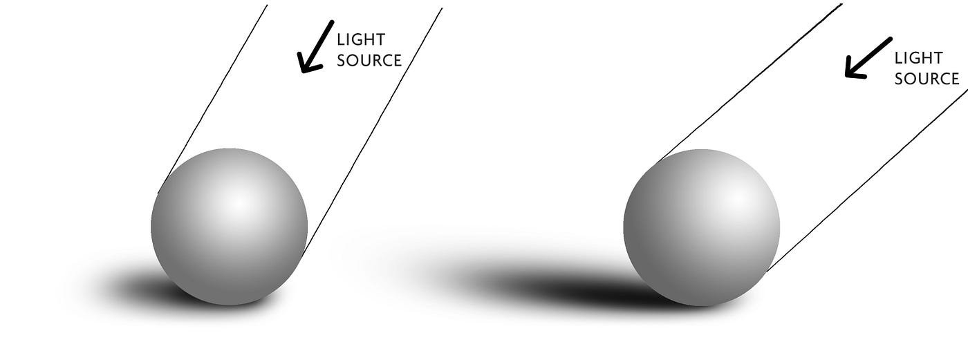
The most effective type of light is a single light source, since when the light comes from just one direction — from a spotlight for instance — then the shadows tend to be more consistent and cleaner.
For artists, there is a practical advantage to setting up a deliberate source of light, rather than drawing with multiple or general light sources when the shadows can overlap and be puzzling to represent.
Hard Light Versus Soft Light
Artists tend to choose between hard light and soft light, each providing different effects.
Hard light yields clearly delineated shadows, creating the widest tonal range between light and dark, whereas diffused light creates softer shadows that occupy more of the mid-tones.

One interesting way of looking at works of art is to ask how wide the tonal range is within the image — that is, how bright are the highlights and how dark are the shadows?
The 20th century artist Tamara de Lempicka had a preference for hard light and well-defined shadows to provide a sculpted depiction of women and men. Her work tends to span the full tonal range in tight spaces, employing the brightest lights alongside the shady darks.
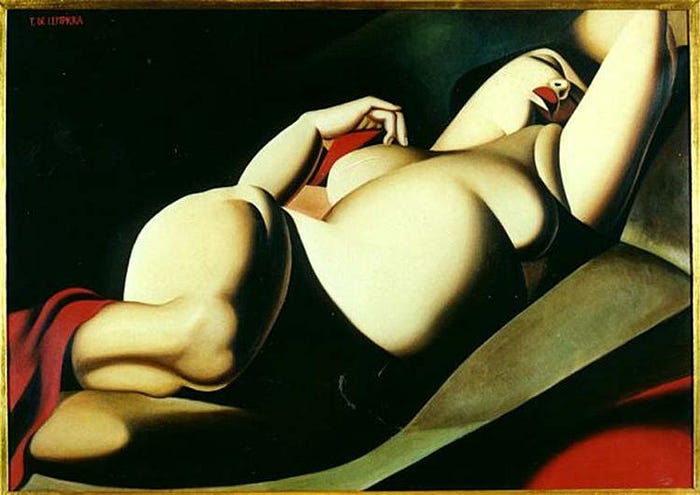
In the example above, La Belle Rafaela, painted in 1927, De Lempicka utilised an emphatic combination of light and shadow to form a potent and memorable nude.
In contrast to the De Lempicka painting, the shadows in this painting by the Danish artist Wilhelm Hammershoi (below) are dispersed, emanating calmly from the light through a window.

In Interior with Young Man Reading, painted in 1898, there is an overall sense of peace and solitariness. The shadows sweep across the room with a narrower tonal range and softer outlines. And the artist has deliberately placed the main subject of the work — the man reading the letter — in the corner shadow of the room, as if he has achieved some psychological privacy by staying out of the direct sunlight.
Creating Mood
As we’ve seen, light and shade are utilised by artists to create a setting and a mood. Shadows can generate ambience, feeling, atmospheric conditions and dramatic tenor.

The Parthenon (1871) by Frederic Edwin Church uses a brilliant device of placing the foreground in shadow — a shadow that runs diagonally upwards from left to right. The effect is to elevate the ancient temple both visually and symbolically, as it is uniquely bathed in this glowing light. The shadow also pulls the viewer inwards, leading the eye to the lighter and more distant details.
A slightly different mood is achieved in this painting by Edward Hopper, Pennsylvania Coal Town (1947), with the figure standing in the full beams of the late afternoon sun.

By breaking up the image into distinct rectangles of light and shadow, Hopper has managed to capture a sense of loneliness and meditation. The man has stopped midway through a mundane task, gazing off beyond the canvas — conjuring a mood of paused contemplation.
Painted Realism
One of the first artists to make explicit use of light and shade was Leonardo da Vinci, who made numerous observations about the nature of light in his notebooks:
“Light is the expeller of darkness. Shadow is the suppression of light.
Primary light is that which is the cause of the lighting of shaded bodies.
And the derived lights are those parts of bodies which are illumined by the primary light.
Primary shadow is that side of a body on which the light does not fall.
Derived shadow is simply the striking of shaded rays.”
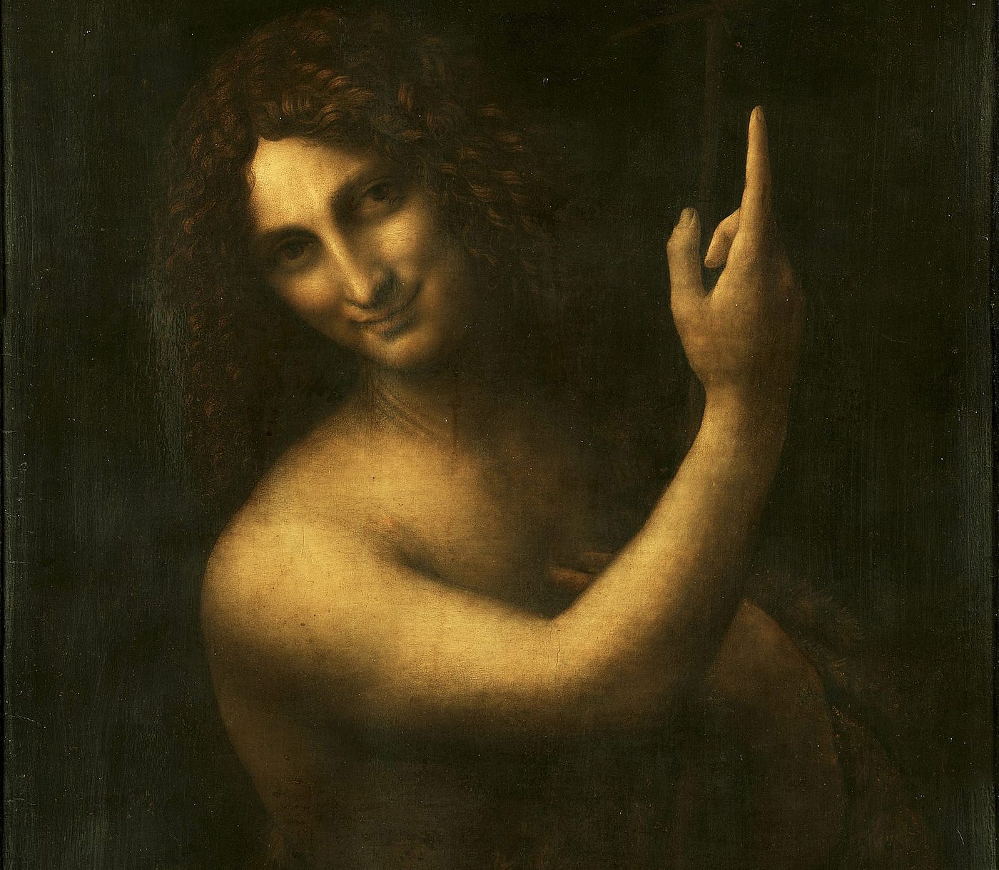
Leonardo’s innovations using light and shade can be seen in the image below: on the left is Leonardo’s painting Lady with an Ermine (1483–1490), whilst on the right is a slightly earlier portrait painting, Portrait of a Man (c. 1450), by Andrea del Castagno.


Comparing the two works, both paintings adopt a three-quarter pose for the sitter, yet it is Leonardo’s painting that achieves a greater sense of naturalism and psychological depth thanks to the more considered use of a single-source light and greater tonal range from light to dark.
The Italian phrase used to describe such tonal effects is chiaroscuro, a term that originated from the practice of drawing on coloured paper. Artists began with the paper’s original base tone, say pink or cream, and added highlights using white gouache painting and darker tones using black ink or watercolour.
A more extreme use of chiaroscuro can be found in the work of the Baroque artist Caravaggio. Adopting a dramatic form of contrast, Caravaggio used severe lighting to bring out the physical details of his figures and heighten the emotional milieu — as illustrated in his striking depiction of Saint Jerome in his study (1605–6).

Caravaggio developed an intense mode of painting which became known as “tenebrism”, from Italian tenebroso (“dark, gloomy, mysterious”), a style that won him many admirers and created a new generation of “Caravaggesque” followers.
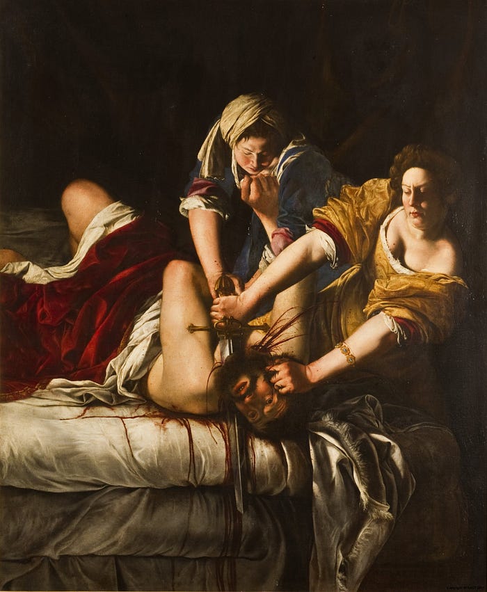
The tenebrist style became the favoured model for many European artists of the 17th century, as can be seen in the vivid and bloody portrayal of Judith Slaying Holofernes painted by Artemisia Gentileschi in around 1620.
Symbolism, Feeling and Form
The symbolism of light and shade seems to take its lead from the psychological relationship that humans instinctively have with light and darkness.
The Old Testament description of the appearance of day and night sets the tone for Western art’s relationship with light and shade:
“And the earth was waste and without form; and it was dark on the face of the deep: and the Spirit of God was moving on the face of the waters. And God said, Let there be light: and there was light. And God, looking on the light, saw that it was good: and God made a division between the light and the dark, Naming the light, Day, and the dark, Night.” (Genesis: 1, 2–5)
Since the Romantic era, light and shade have often been used in art to imply a psychological undertone, with the use of moonlight and crepuscular settings taking prominence, as if the very cycles of night and day bring out a natural primordial response.

In Jean-François Millet’s The Angelus, made between 1857 and 1859, two peasants in a field bow over a basket of potatoes to say a prayer, the Angelus. The sombre mood is heightened by the dusk setting and the strong silhouettes of the two main figures against the fading dusk light.

In Eugène Delacroix’s Liberty Leading the People (1830), a painting that commemorates the July Revolution of 1830, the allegorical figure of Liberty raises the French Revolutionary flag whilst clambering over the fallen bodies of the barricades. The wide tonal range, culminating with the bloom of white light behind her head, heightens the sense of vigour and drama.
Later, with the advent of the Impressionist era, light and shade took on a different aspect in painting, no more so than in this work, Dance at Le Moulin de la Galette (1876), by Pierre-Auguste Renoir, in which the tonal range is diminished in favour of a patterning of colours and textures.
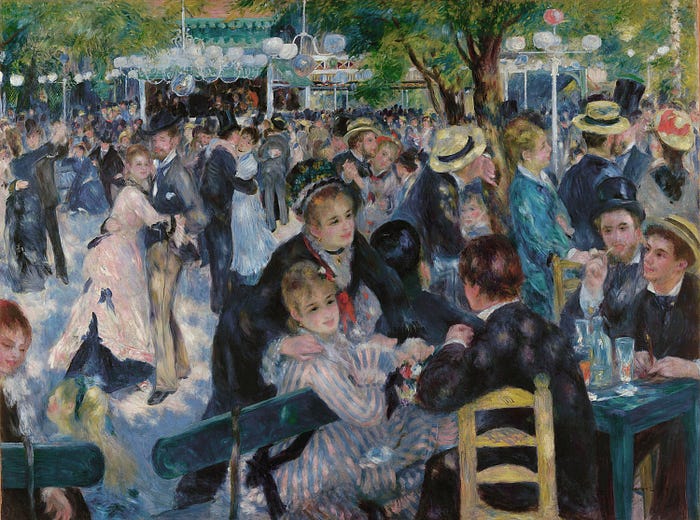
Whilst light is clearly important, no one single area of the painting is given priority. Absent is the extreme chiaroscuro. In its place is a patchwork of light-dappled colours, where the whole canvas is alive with shimmering highlights — and so capturing perfectly the incandescence of a bustling Parisian afternoon.
As 20th century art became more interested in the formal properties of painting, such as composition, colour harmonies and overall unity, so light and shade took on a different purpose other than creating mood or drama.
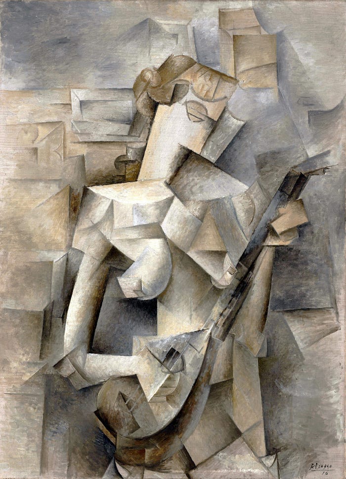
With the advent of Cubism, artists returned to the basic qualities of light and shade in their exploration of shape — thus proving that in art, light and shade are fundamental to the modelling of visual forms. In such a way, the play of tonal contrast becomes a choice that the artist can make, yielding an almost infinite variety of possible effects.

Christopher P Jones is the author of What Great Artworks Say, an examination of some of art’s most enthralling images.
Would you like to get…
A free guide to the Essential Styles in Western Art History, plus updates and exclusive news about me and my writing? Download for free here.
Join me…
On Instagram for more great paintings on the go!